UX Design Course Project 1
An accessible food menu app for a beer garden restaurant that has a lot of food options (healthy and unhealthy) for the customers (users) to choose from. Project Overview
The problem:
Trying to solve the problem that there aren’t a lot of apps that are accessible, reliable, have a variety of menu options, and is upfront about all costs associated with every menu item.
The goal:
The goal is to create an app that has feature to make it more accessible to all users and clearly display the most important information that the users need. A clean and easy to use app for all ages.
My role:
UX designer designing an app for Hops Terrace from start to handoff to engineering.
Responsibilities:
Conducting interviews, conducting usability studies, paper and digital wireframing, low and high-fidelity prototyping, accounting for accessibility, and iterating on designs, etc.
User research: summary
I conducted interviews to understand the users I’m designing for and their needs. A primary user group identified through research was adults 21 to 55 years old who wanted options that are healthy and varied.
This user group confirmed initial assumptions about how Hops Terrace customers would use the app, but research also revealed that information about what is available wasn’t the only limitation. Other user problems included location, delivery/pickup options, and variety of food options
User research: pain points
Accessibility
Text can be hard to read for those who are older. There are limited options to help these individuals. The design will need to include certain features that will give users the option to use certain accessibility tools to improve their experience.
Menu Options
The users have no way of knowing if a menu option is healthy or unhealthy. Clearly marking the different menu items will help the users make the distinction between each item.
Reliability
There is no clear indication of when an order will be ready or to double check their order, causing some users to have an unpleasant experience. There will need to be additional features that will give the users a way to track and check their orders.
Cost
Certain items are hidden in the menu and only show up when selected. Being upfront about the cost of all menu items will give the user more clarity of what their cost will be.
Persona 1
Persona 2
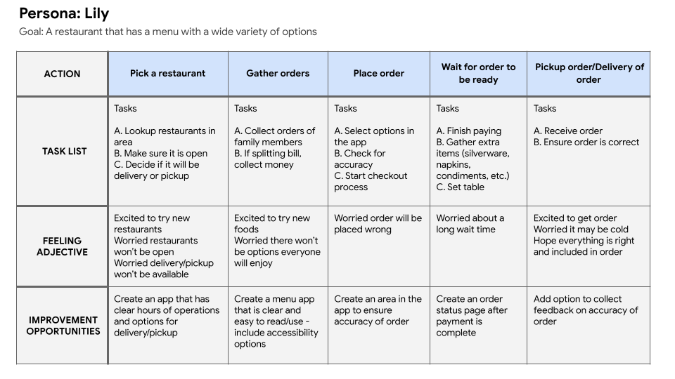
Mapping Lily’s user journey revealed how helpful it would be for users to have a dedicated app for looking up and ordering food.
PAPER Wireframes
Taking time to draw a screen out by hand ensured that the elements that I wanted to include on the page were picked out before designing in a program. It made the process of designing the app in the next steps easier as the elements were all planned out ahead of time.
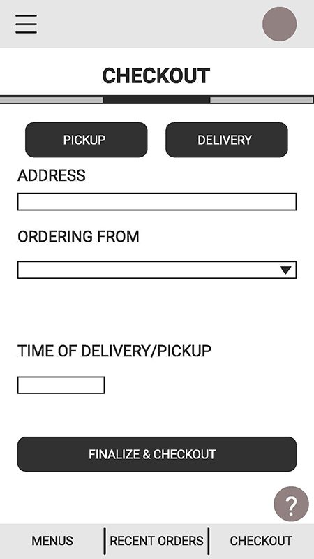
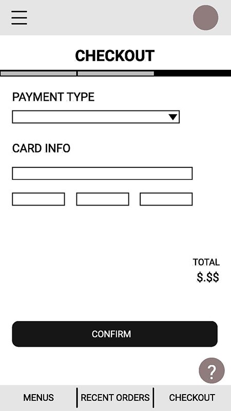
Lo-Fidelity Prototype



Usability study: findings
Round 1
Users want to view and order a variety of food options
Users want to have the ability to pickup or have their food delivered
Round 2
Participants were unsatisfied with the length of the checkout process
Some buttons are hard to find and use
Participants were confused by the lack of a cart and different payment options
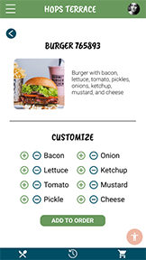
Hi-Fidelity Prototype


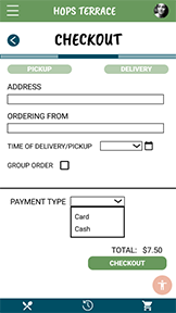

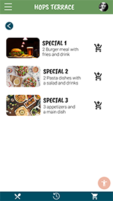
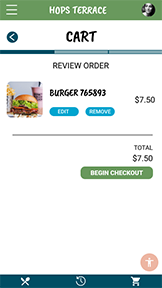
What I learned
I learned that there are more steps to designing an app than what I previously thought. There are more elements to take into account than just the basic click here and this will happen. Building out all the different interactions that a user will face in an app is challenging but enlightening.
Next steps
Conduct further user research to ensure the previous pain points have been addressed
Use the user research to see if any other areas of concern have come about and address those
Update and add more accessibility options


