UX Design Course Project 2
A website where students can take quizzes, discuss, and learn about art.Project Overview
The problem:
Trying to solve the problem that there aren’t a lot of websites that are accessible, reliable, have a variety of ways to learn/discuss about art.
The goal:
The goal is to create an app that has feature to make it more accessible to all users and clearly display the most important information that the users need.
My role:
UX designer designing a website for Art Pastiche from start to handoff to engineering.
Responsibilities:
Conducting interviews, conducting usability studies, paper and digital wireframing, low and high-fidelity prototyping, accounting for accessibility, and iterating on designs, etc.
User research: summary
I conducted interviews to understand the users I’m designing for and their needs. A primary user group identified through research was adults over the age of 18 years old who wanted a way to quiz themselves and then learn more about an art subject.
This user group confirmed initial assumptions about how Art Pastiche customers would use the website, but research also revealed that there wasn’t a place for them to discuss, and learn more about subjects they weren’t familiar with.
User research: pain points
Accessibility
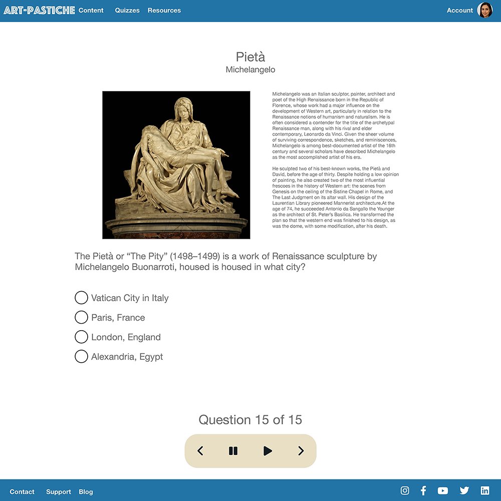
Text can be hard to read for those who are older. There are limited options to help these individuals. The design will need to include certain features that will give users the option to use certain accessibility tools to improve their experience.
Reliability
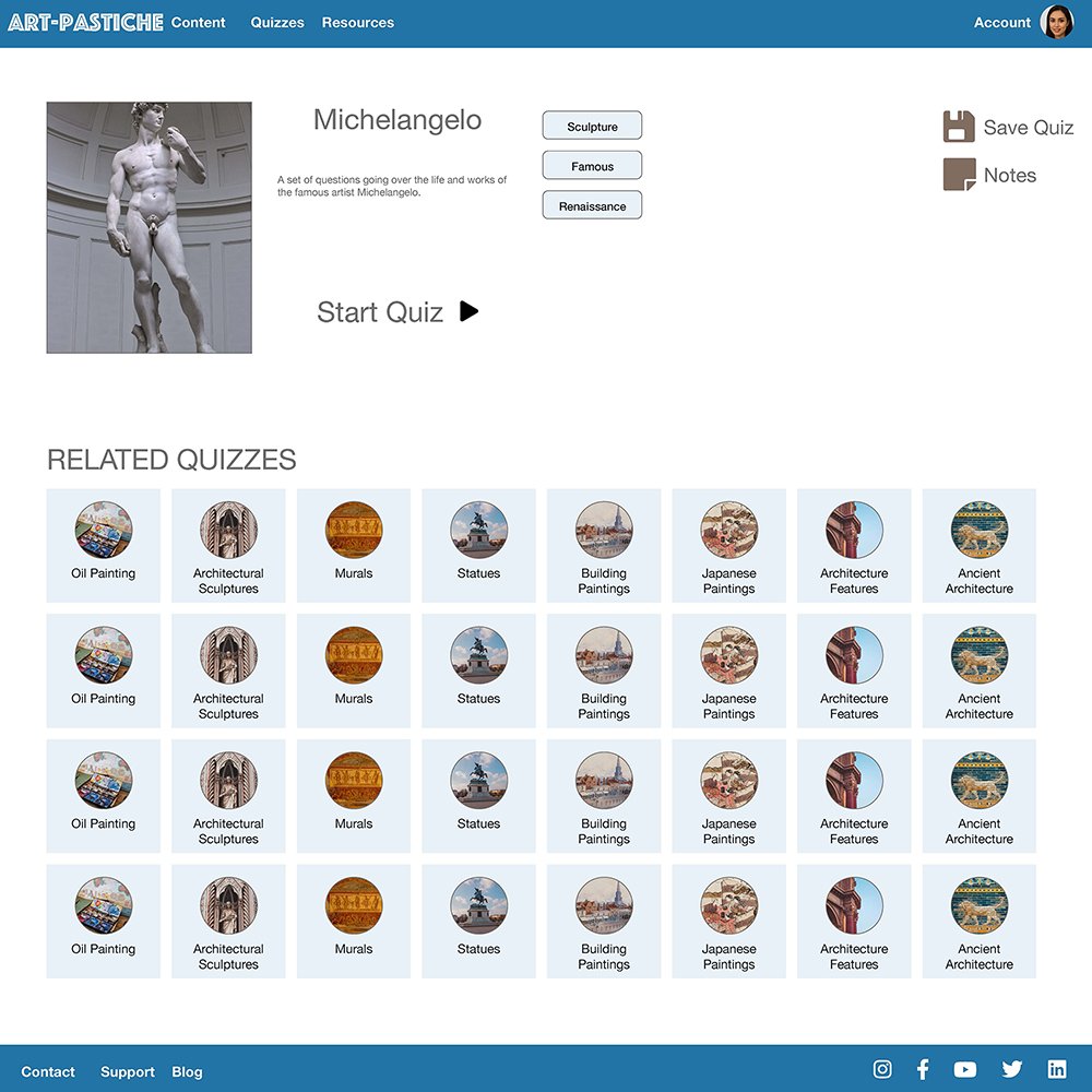
There is no clear indication of where they should go next to learn more about a subject, causing some users to have an unpleasant learning experience.
Interaction
Certain items are hidden in the menu and only show up when selected. Being upfront about the cost of all menu items will give the user more clarity of what their cost will be.
Persona 1
Problem statement:
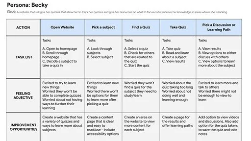
Becky Lewiston is a university student who needs a way to quiz themselves to know where they are lacking certain knowledge because they feel they are struggling in certain subjects.
Mapping Lily’s user journey revealed how helpful it would be for users to have a dedicated app for looking up and ordering food.
PAPER Wireframes
Taking time to draw a screen out by hand ensured that the elements that I wanted to include on the page were picked out before designing in a program. It made the process of designing the website in the next steps easier as the elements were all planned out ahead of time.
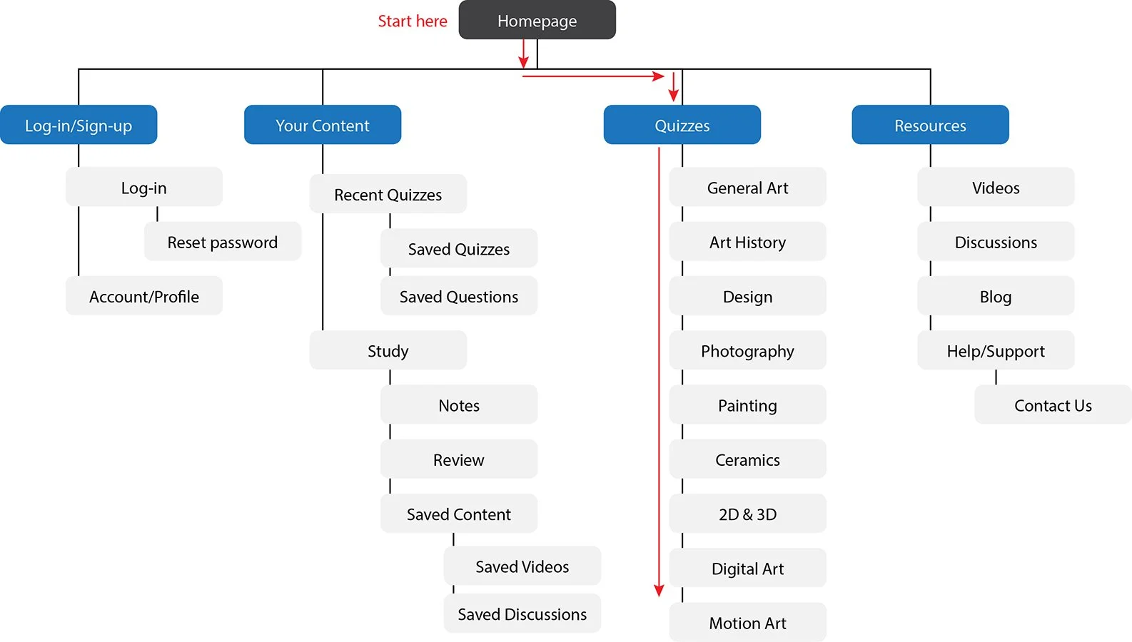
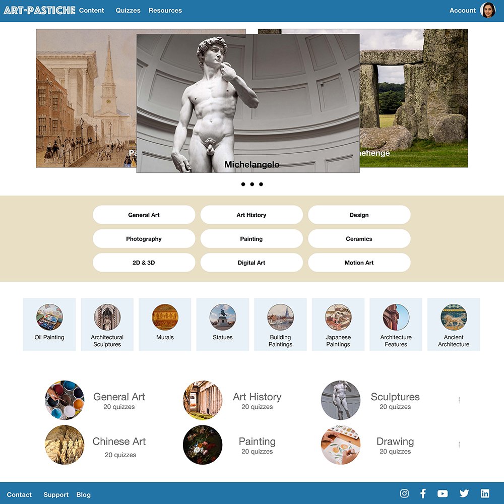
The site map was created to improve overall website navigation. I tried to make decisions for the site map to make things simple and easy.
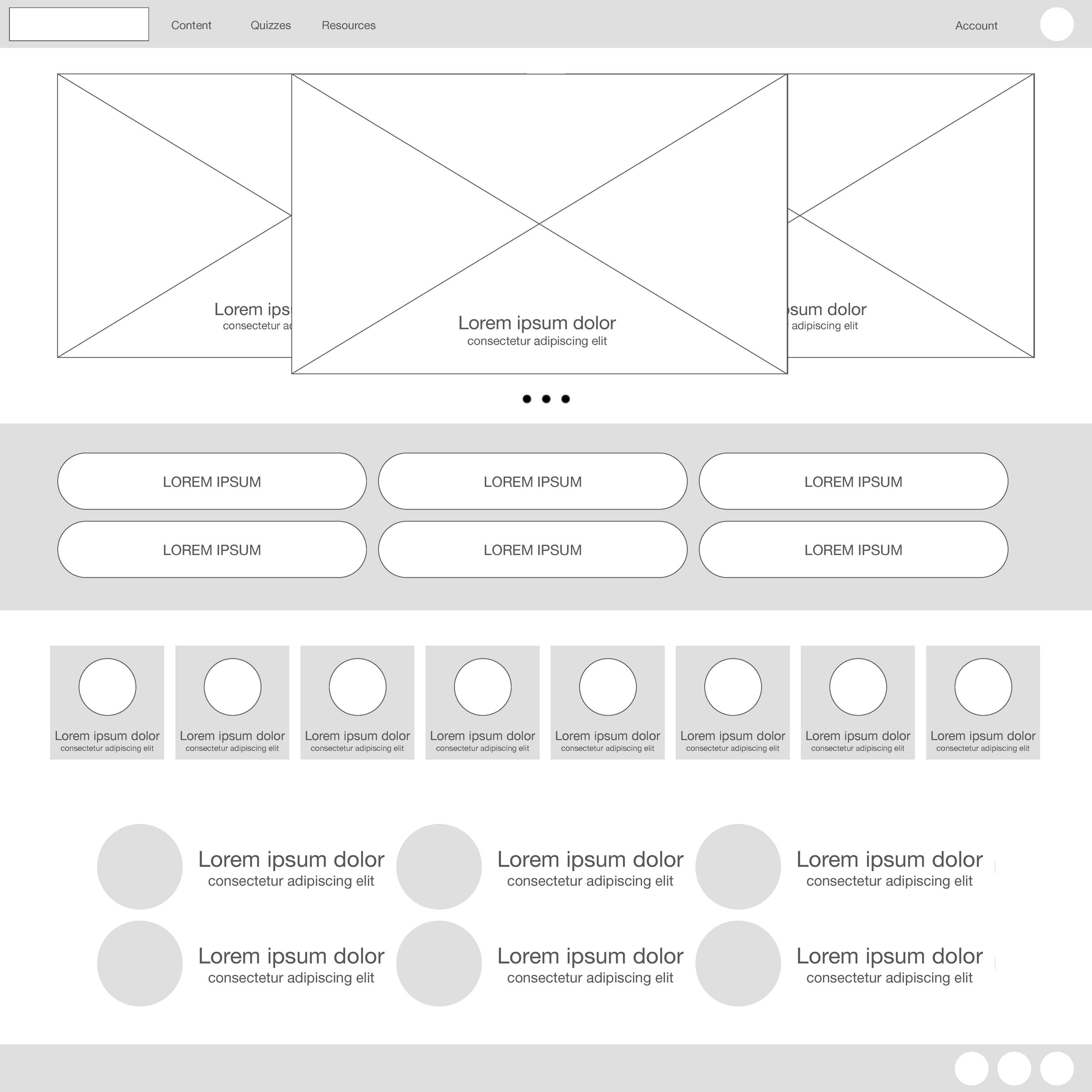
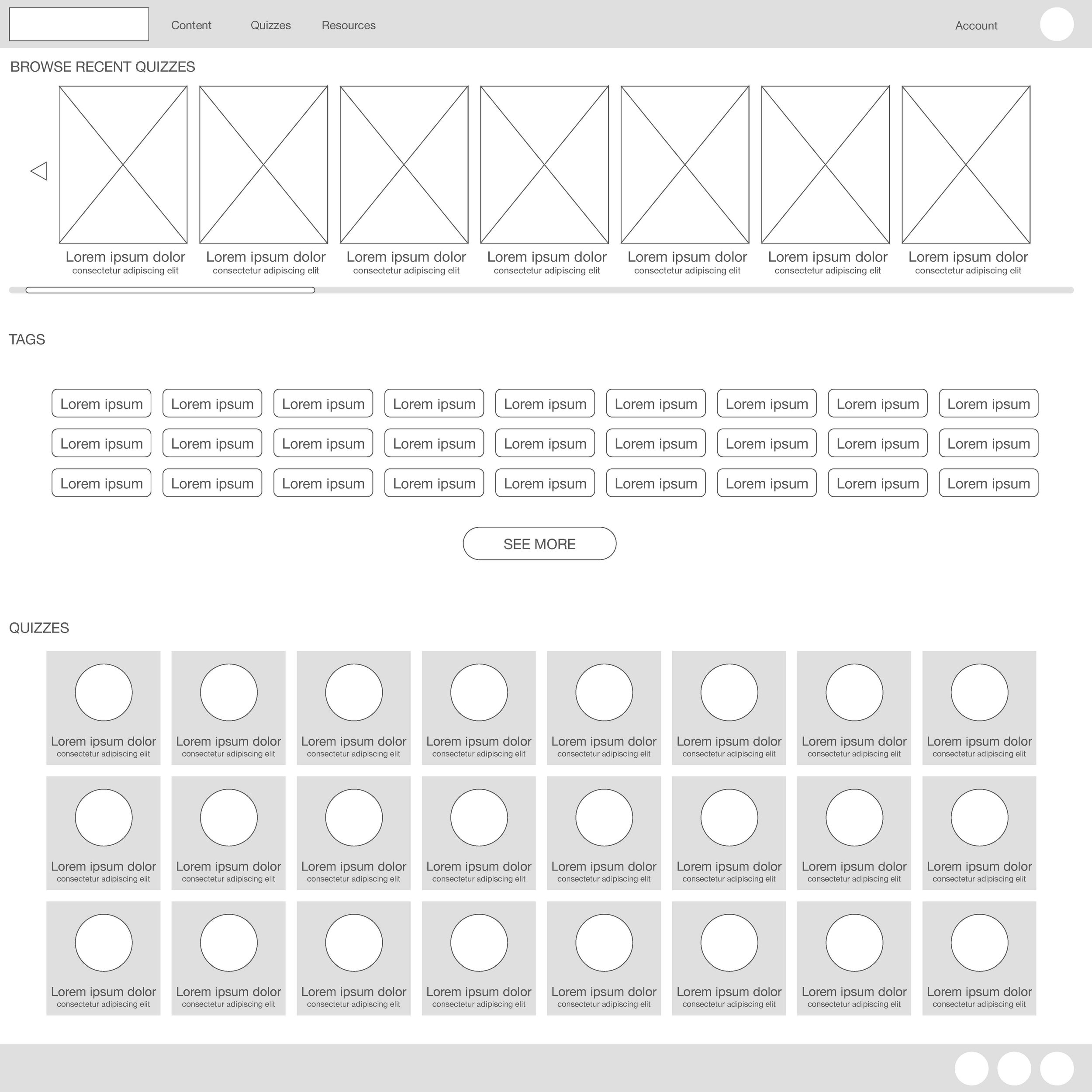
Lo-Fidelity Prototype


Usability study: findings
Round 1
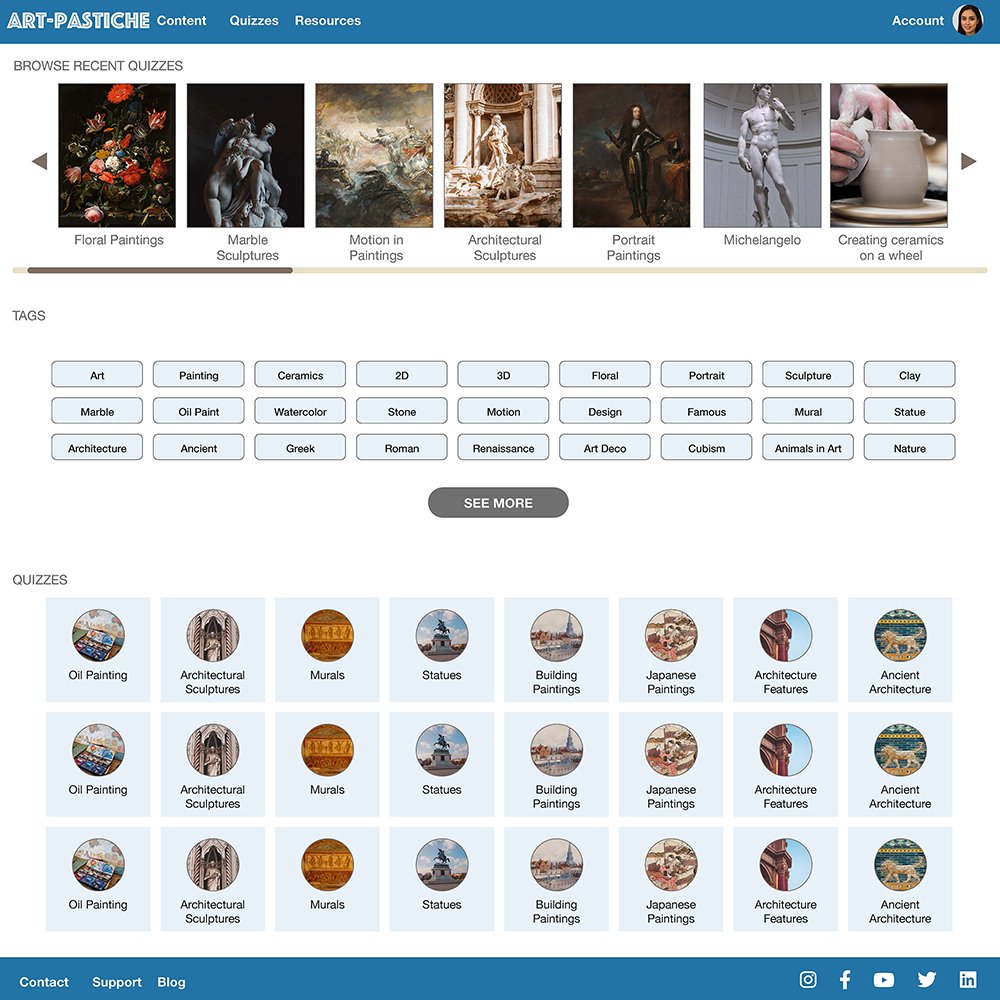
Some of the text was a bit small.
Some of the buttons were too large.
There were too many options on some of the pages.
Hi-Fidelity Prototype
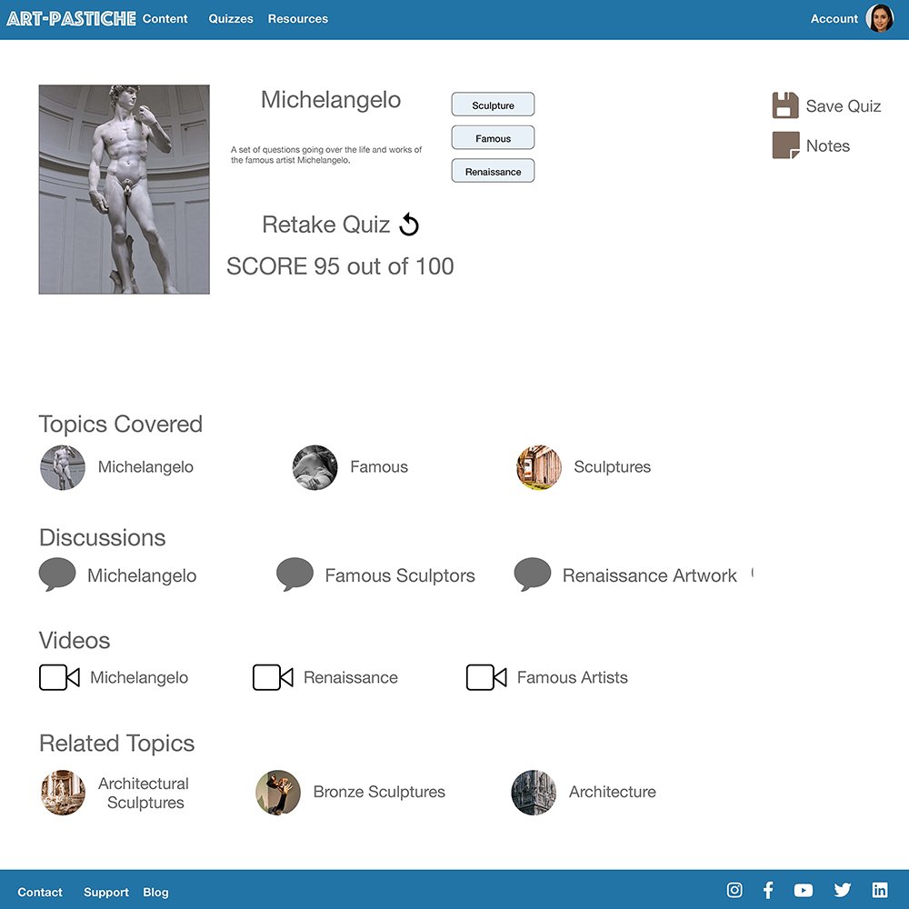
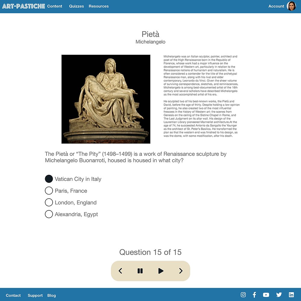


What I learned
I learned that there are more steps to designing a website and mobile app than what I previously thought. There are more elements to take into account than just the basic click here and this will happen. Building out all the different interactions that a user will face in an app is challenging but enlightening.
Next steps
Conduct further user research to ensure the previous pain points have been addressed
Use the user research to see if any other areas of concern have come about and address those
Update and add more accessibility options


