UX Design Course Project 3
An app and website that people can use to help them learn to read in a new language.Project Overview
The problem:
Trying to solve the problem that there aren’t a lot of websites that are accessible, reliable, have ways for people to learn to read in new languages.
The goal:
The goal is to create an app and website that has feature to make it more accessible to all users which clearly displays the most important information that the users need.
My role:
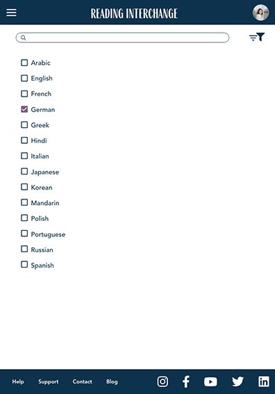
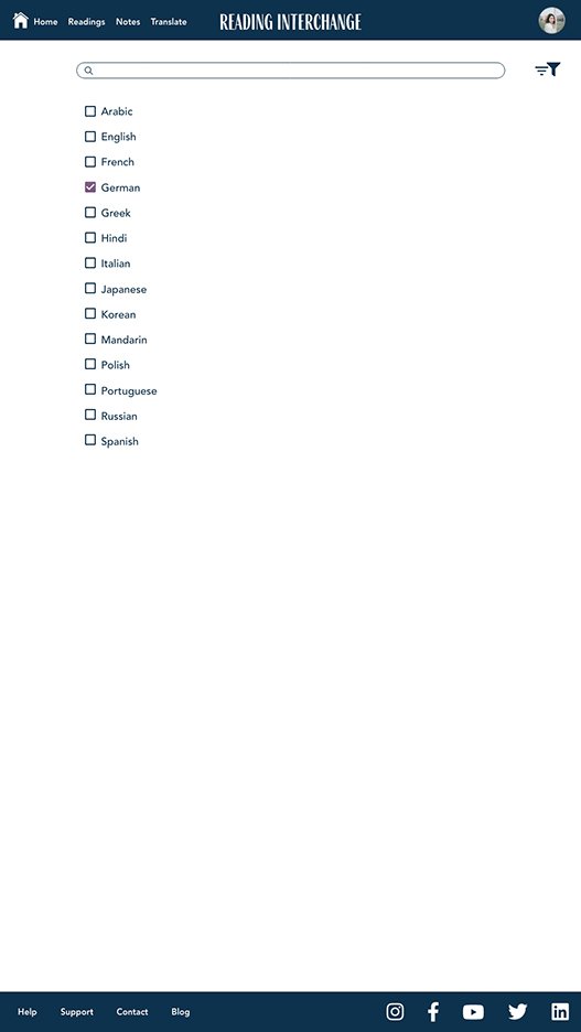
UX designer designing a responsive website that will work for any screen size including tablet and mobile, for Reading Interchange from start to handoff to engineering.
Responsibilities:
Conducting interviews, conducting usability studies, paper and digital wireframing, low and high-fidelity prototyping, accounting for accessibility, and iterating on designs, etc.
User research: summary
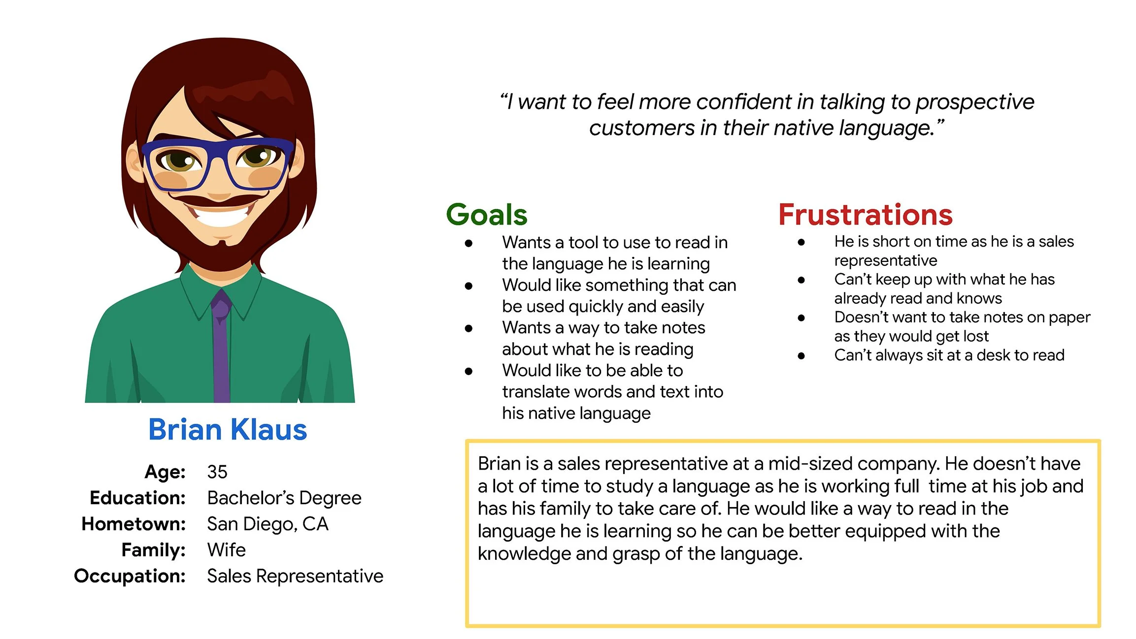
I conducted interviews to understand the users I’m designing for and their needs. A primary user group identified through research was adults over the age of 18 years old who wanted a way to learn to read in a new language.
This user group confirmed initial assumptions about how Reading Interchange customers would use the website, but research also revealed that there wasn’t a place for them to take notes, save the things they’ve read, translate into their native language, and find definitions for certain terms.
An audit of a few competitor’s products provided direction on gaps and opportunities to address with the Reading Interchange app.
PAPER Wireframes
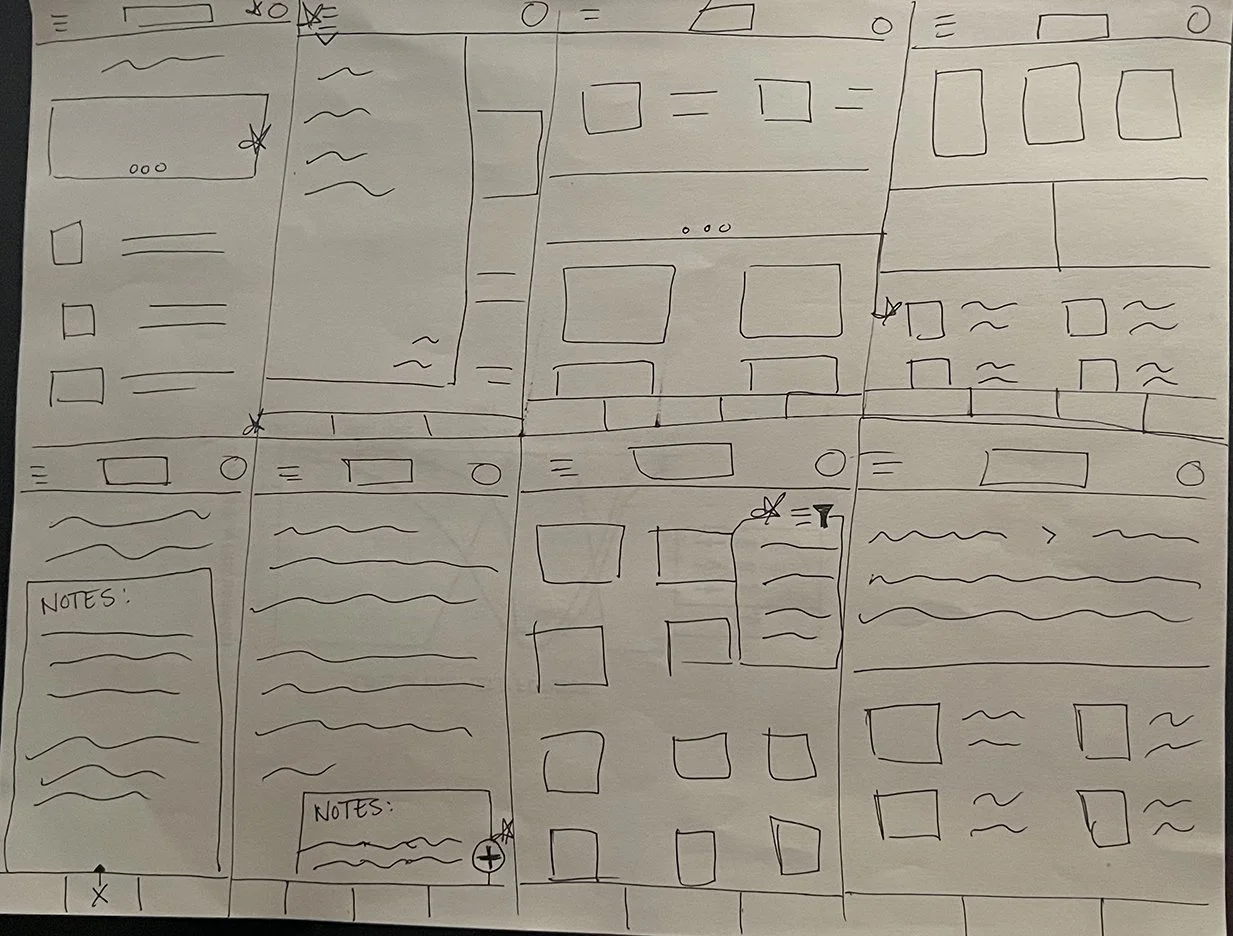
Taking time to draw a screen out by hand ensured that the elements that I wanted to include on the page were picked out before designing in a program. It made the process of designing the website in the next steps easier as the elements were all planned out ahead of time.
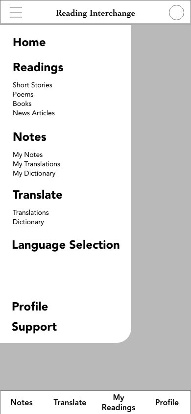
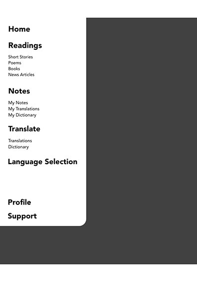
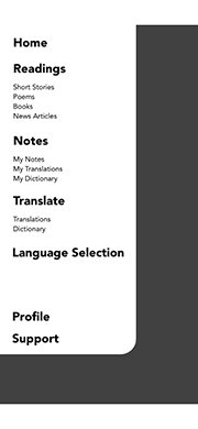
The site map was created to improve overall website navigation. I tried to make decisions for the site map to make things simple and easy.
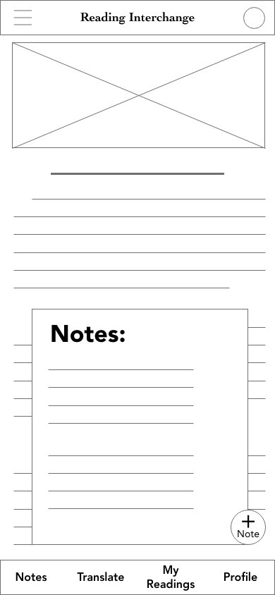
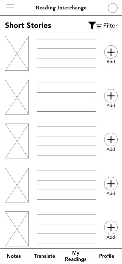
Lo-Fidelity Prototype


Usability study: findings
Round 1
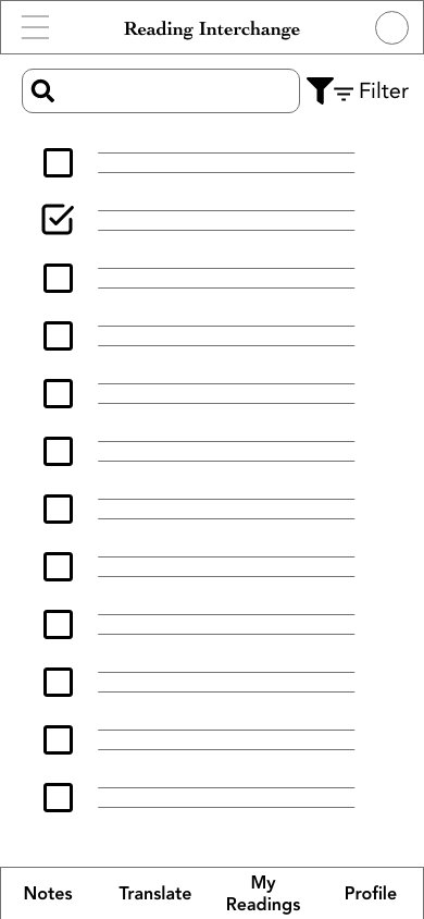
Some of the styling on elements is unnecessary.
Some of the buttons were too large.
There were too many options on some of the pages making it look crowded in certain spots.
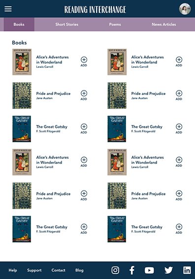
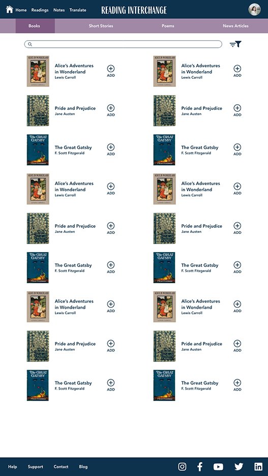
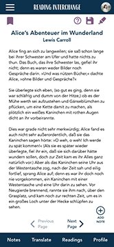
Hi-Fidelity Prototype





What I learned
I learned that there are more steps to designing an app that works across multiple screen sizes than what I previously thought. There are more elements to take into account than just the basic click here and this will happen. Building out all the different interactions that a user will face in an app is challenging.
Next steps
Conduct further user research to ensure the previous pain points have been addressed
Use the user research to see if any other areas of concern have come about and address those
Update and add more accessibility options


